Fox Design System: A Case Study in creating a Fast Deployment Design System for a Startup MVP
As the lead designer of the Fox Design System, I was responsible for ensuring that our design process was extremely fast, tightly locked to development, and scalable for future growth. When I joined, we had no formal design system—just a collection of inconsistent UI patterns and ad-hoc component reuse. This lack of structure meant that design and engineering were constantly misaligned, leading to redundant work and inefficiencies that slowed down development. By the time I had completed my work, we had established a streamlined, documented design system that was built for speed and deeply integrated with development. This alignment significantly improved collaboration, eliminated inconsistencies, and accelerated the pace of iteration, allowing us to ship a dynamic Minimum Viable Product.
Background
• The Fox Design System was created from scratch due to the absence of a pre-existing design framework. Without an existing system, there were no limitations from outdated structures, allowing for a fresh and modern approach to design and development.
• As a new product, it was essential to integrate design and development tightly. The workflow was structured so that every design decision translated directly into code with minimal loss in translation, ensuring a seamless experience from design to production.
• The primary goal was to unify the brand and product under a cohesive system. By maintaining consistency across all aspects of the design and development lifecycle, the system aimed to create a recognizable and trustworthy brand identity while improving efficiency.

Goals: Laying the Groundwork for Scale
Speed: The success of MVP projects depended on designs being easily translatable to code without time-consuming rebuilds or redesigns. Delays in the design-to-development handoff could be detrimental to meeting project deadlines, making speed thorough design and development a core focus of the design system.
Integration: The design and development teams worked from a shared library of patterns that spanned design and code, eliminating inefficiencies. By maintaining a single source of truth, inconsistencies were reduced, and the process became more streamlined.
Roadmap Development: With the help of front-end engineers, we built an informed roadmap to build the design system UX and codebase, ensuring each component had clear usage guidelines and was directly translatable to code.
Brand Consistency: Establishing a unified brand experience to improve perception and user trust. Every component, from buttons to complex interactive elements, followed strict guidelines to ensure that the user experience remained predictable and professional.
Accessibility and Responsiveness: Ensuring the product is competitive by prioritizing inclusive design, adaptability across devices, and localization. The design system was built with WCAG compliance in mind, ensuring that all users, regardless of ability, could engage with the product effectively.
Design is not just what it looks like and feels like. Design is how it works.” – Steve Jobs
Building on a Philosophy of Configurability
Given the product’s connection to the automotive and mechanics industry, existing design patterns, fonts, and colors were analyzed. Automotive industry standards and conventions were reviewed to align the product with familiar visual cues while maintaining a unique identity.
• Responsiveness was critical, as many users—owner-operators—work in constrained spaces while using their phones to document repairs and complete extensive paperwork. The design system prioritized mobile-friendly layouts, ensuring that forms and interfaces were easy to interact with, even in less-than-ideal working conditions.
• Search functionality was a major focus, with complex autocompletes requiring thoughtful integration within the design process. Search experiences were optimized for speed and accuracy, leveraging intuitive filtering and categorization techniques to enhance usability.

Buy-In to the Vision
• Securing stakeholder buy-in was a key challenge, given the startup’s limited financial resources. With restricted budgets, it was necessary to demonstrate the tangible benefits of the design system, such as reducing future development costs and increasing user engagement.
• A live demonstration showcasing the advantages of a design system in streamlining design and development helped to gain executive and team support. This demonstration illustrated how quickly components could be implemented and how much time would be saved in the long run.
• The initiative emphasized co-ownership among design, management, and engineering. By fostering collaboration, every team had a vested interest in maintaining and improving the design system, ensuring long-term success.
Design Exploration
• The foundation was established by defining color palettes, typography, and spacing. These fundamental elements served as the building blocks for all components, ensuring consistency and scalability.

• Components were built from scratch in Figma to ensure full control and customizability. Each component was meticulously designed to accommodate various states, interactions, and accessibility considerations.
Research included
- Evaluating established design systems from leading technology companies to gather best practices
- Understanding the industry landscape to ensure that the design system aligned with automotive and mechanical industry standards.
- Analyzing AI-driven product requirements to optimize the system for future automation and per
- Ensuring responsiveness and accessibility across all states, including hover, focus, and error handling.
Accessibility Planning
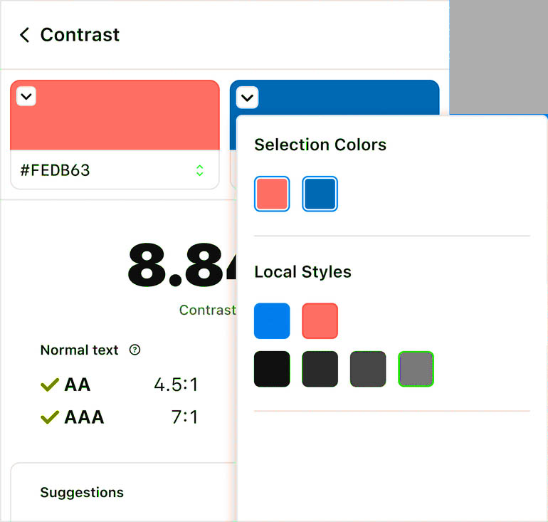
- I designed each component with accessibility as a top priority, ensuring compliance with WCAG AA standards. I carefully selected colors for all UI elements to provide sufficient contrast and improve usability for individuals with low vision. Using tools like the Stark Figma plugin and Google Chrome’s built-in Lighthouse DevTools accessibility checker, I validated my choices to create an inclusive experience.
- I worked closely with developers to ensure that our implementation preserved Material-UI’s built-in accessibility features while enhancing usability where needed.
- Beyond color, I implemented ARIA attributes to enhance screen reader compatibility, ensuring that elements like buttons, links, and modals provide meaningful context. Interactive components also include accessible focus states and hover indicators, making navigation seamless for keyboard users. By integrating these accessibility features, I created a user-friendly interface that works for everyone.


Establishing a System of Governance
Once the foundational design system components were stabilized, I turned my attention to governance and operational processes to ensure the system could evolve sustainably.
• Designers and engineers collaborated on each component’s planning and implementation. This ensured that components were not only visually consistent but also technically feasible.
• A Discord channel was established for real-time feedback and discussions. This provided an informal yet effective way to quickly address questions, share progress, and implement improvements.
• Conducted regular design critiques, where the paired designer and developer participated together, giving both designers and engineers visibility into new components before they were finalized.
Clear and Accessible Documentation
• Created a Figma prototype library to serve as a single source of truth
• Provided in-depth documentation on component behavior, constraints, and use cases.
• Worked with the engineering team to rebuild Storybook for interactive, code-driven documentation.
The Future
• Expanding the component library to support new product features and use cases.
• Enhancing AI-driven conversational patterns to improve user interactions.
• Establishing automated compliance testing to maintain accessibility and responsiveness standards.
From its inception, the Fox Design System was designed for speed, scalability, and efficiency. By tightly integrating design and development, we reduced design debt and improved consistency across the product. The success of a design system doesn’t lie in just the components themselves, but in the workflows, processes, and culture that support its adoption.
By fostering shared ownership, clear governance, and strong documentation, the Fox Design System has become a foundational pillar for product growth and innovation.
